Case Study · Proposed Redesign / Concept
NextIF
Repositioning an Ethical Finance Ecosystem Through a Modern Homepage Experience
This case study explores a proposed homepage redesign for NextIF, a global ethical finance and innovation ecosystem. The goal was to improve clarity, credibility, visual hierarchy, mobile experience, and trust-building across the digital experience while preserving the organization’s existing mission and brand direction.
Context
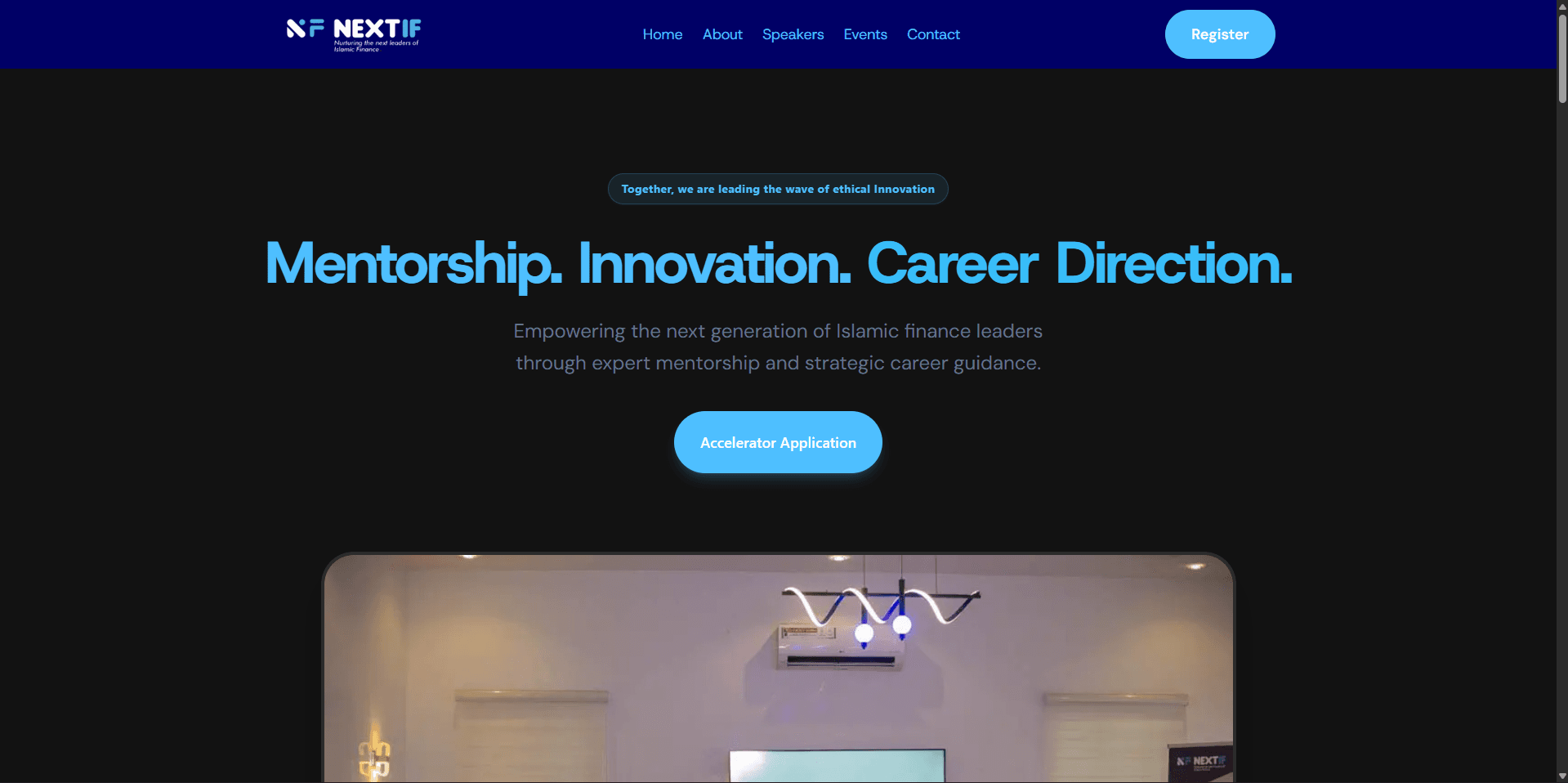
NextIF is positioned around ethical finance, innovation, mentorship, accelerator programs, speakers, and global community building. While reviewing the existing website, it became clear that the organization had strong content and credibility assets, but the homepage experience did not fully communicate the scale or quality of the platform.
The redesign was approached as a strategic concept: not just to make the website look more polished, but to reframe how NextIF presents its ecosystem, builds trust, and guides users through its value.
Brand & Platform Insight
A closer review of NextIF’s website revealed that the organization is more than a simple educational platform. It operates as an ecosystem connecting emerging innovators with ethical finance education, accelerator opportunities, mentorship, speakers, partners, and a global community.
The strongest assets already existed within the brand:
- Global community and country reach
- Recognizable speakers and mentors
- Accelerator program structure
- Ethical finance and innovation positioning
- Partner and ecosystem credibility
The opportunity was to bring these assets forward and structure them into a clearer homepage journey that felt more modern, trustworthy, and globally positioned.
Key Findings
- The homepage lacked a strong visual hierarchy and did not clearly guide users through the organization’s value.
- High-value credibility assets such as speakers, mentors, partners, and impact statistics were underutilized.
- Sections felt disconnected, making the experience feel more like stacked content than a guided ecosystem journey.
- The existing presentation did not fully reflect NextIF’s global, innovation-driven positioning.
- The website relied too heavily on static presentation and did not create enough emotional engagement.
- Mobile navigation and responsive behavior needed stronger attention for a better small-screen experience.
- The homepage needed stronger image-led storytelling to communicate people, community, mentorship, and global collaboration.
Project Objectives
- Reposition the homepage as a global ethical finance ecosystem rather than a generic organization website.
- Improve trust by highlighting speakers, partners, community reach, and accelerator structure more clearly.
- Create a stronger storytelling flow from awareness to credibility to action.
- Make the visual experience feel more modern, premium, and aligned with the existing NextIF logo identity.
- Improve responsiveness and mobile navigation for smaller screens.
- Build reusable sections and components using Next.js, Tailwind CSS, and shadcn/ui.
Strategic Direction
The redesign strategy focused on turning the homepage into a guided ecosystem journey. Instead of presenting information as separate blocks, the page was structured to build momentum from first impression to trust, clarity, engagement, and conversion.
The new flow was structured around:
- A stronger hero section to communicate mission and positioning
- Impact statistics to establish credibility early
- An ecosystem section explaining what NextIF actually enables
- An accelerator section positioned as a practical growth pathway
- A speakers carousel to elevate expert credibility
- A partner carousel to reinforce ecosystem backing
- A stronger final CTA and footer to complete the experience
Design Direction
The visual direction was built around the existing NextIF identity, especially its modern blue/cyan brand energy. The goal was to avoid creating a completely different brand and instead evolve the website into a more refined version of what the identity already suggested.
- Host Grotesk typography to match the brand’s existing feel
- Dark premium sections to communicate depth and authority
- Cyan and blue glow accents inspired by the logo
- Image-led sections to make the platform feel more human
- Glassmorphism and soft borders for a modern fintech feel
- Carousel-based content for speakers and partners
- Consistent rounded cards, spacing, and section rhythm
Key Improvements
- Rebuilt the hero section with stronger messaging, clearer CTAs, image-led storytelling, and trust indicators.
- Redesigned the impact section to feel like platform credibility rather than plain statistics.
- Reframed the ecosystem section into a connected explanation of how NextIF supports learning, mentorship, innovation, and collaboration.
- Positioned the accelerator section as a structured 5-week journey from learning to building.
- Turned the speakers section into a premium carousel using real speaker profiles from the existing website.
- Reworked the partners section into a responsive logo carousel to make the ecosystem backing feel more active.
- Added a responsive mobile navigation menu with outside-click closing behavior.
- Redesigned the footer with social links, contact information, and a stronger platform summary.
Mobile Experience
Mobile responsiveness was treated as a key part of the redesign rather than an afterthought. Since many users will likely discover the platform on smaller screens, the navigation, carousel behavior, spacing, CTA placement, and section rhythm were adjusted to feel natural on mobile.
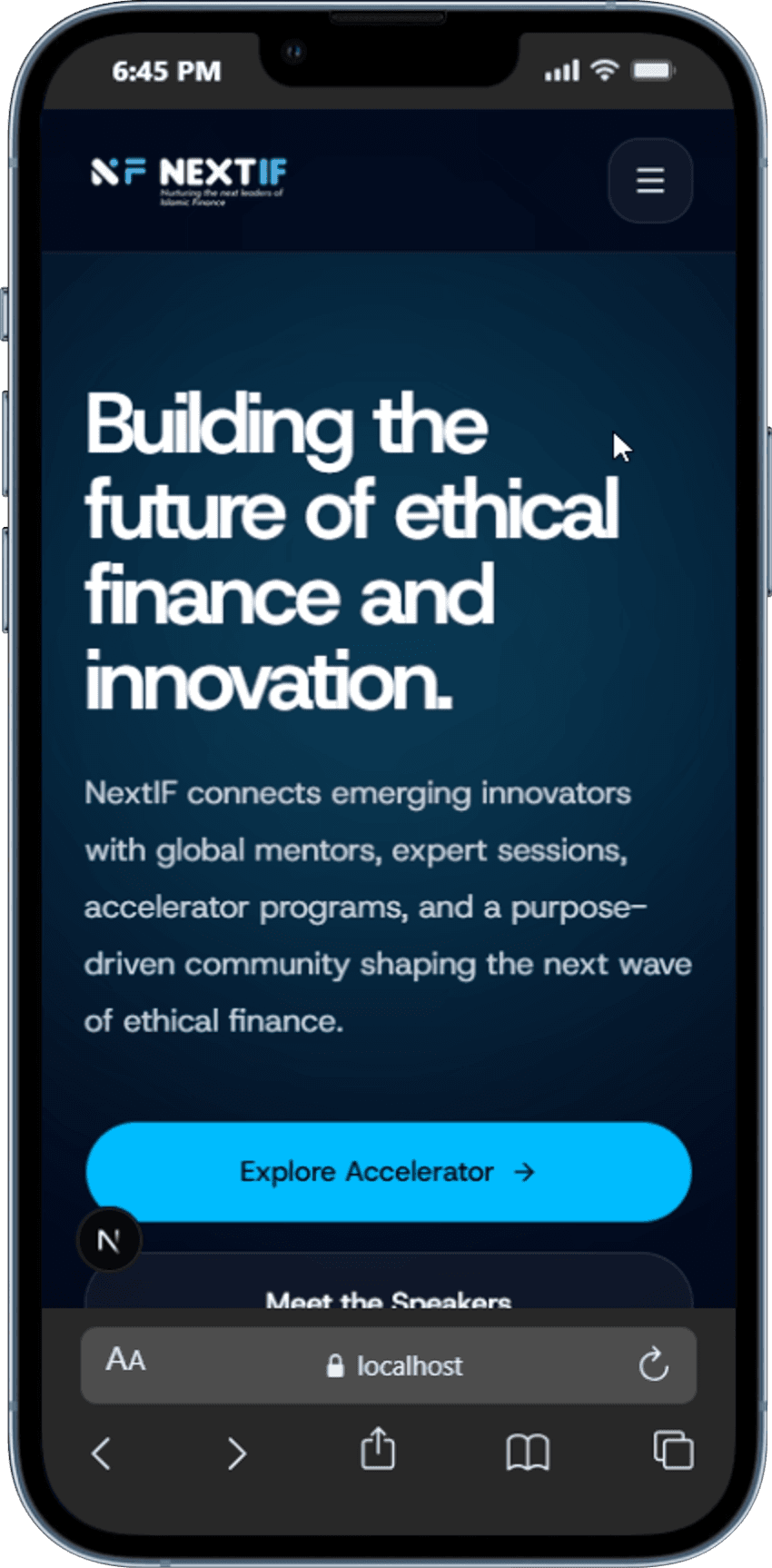
- Added a dedicated mobile menu instead of hiding navigation
- Moved CTA buttons into better positions on smaller screens
- Used carousel layouts to reduce content overload
- Adjusted spacing and image sizing for better readability
Demo & Comparison
The concept below demonstrates how a stronger structure, clearer storytelling, and more intentional visual system can make NextIF feel more credible, modern, and globally positioned.
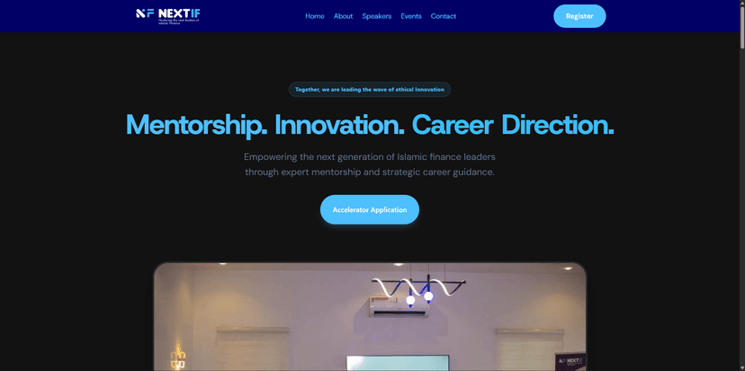
Before
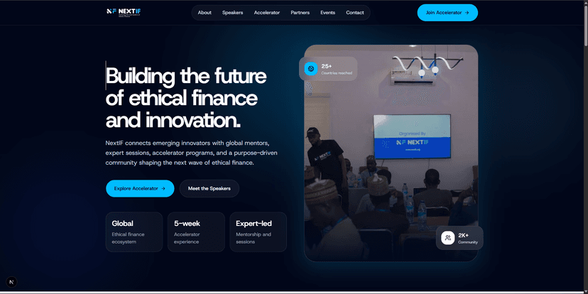
After
Project Status
This work was created as a proposed redesign and independent UX/UI concept to explore how NextIF could better communicate its mission, ecosystem, and credibility online. It is not an official implementation, but a strategic design exercise built to demonstrate how the organization’s digital experience could be improved.
Key Takeaways
- Strengthened my ability to identify gaps between organizational value and digital presentation.
- Improved my approach to designing trust systems through speakers, partners, impact data, and structured content flow.
- Practiced turning a homepage into a guided ecosystem journey rather than a collection of disconnected sections.
- Reinforced the importance of responsive navigation and mobile-first polish in modern landing pages.